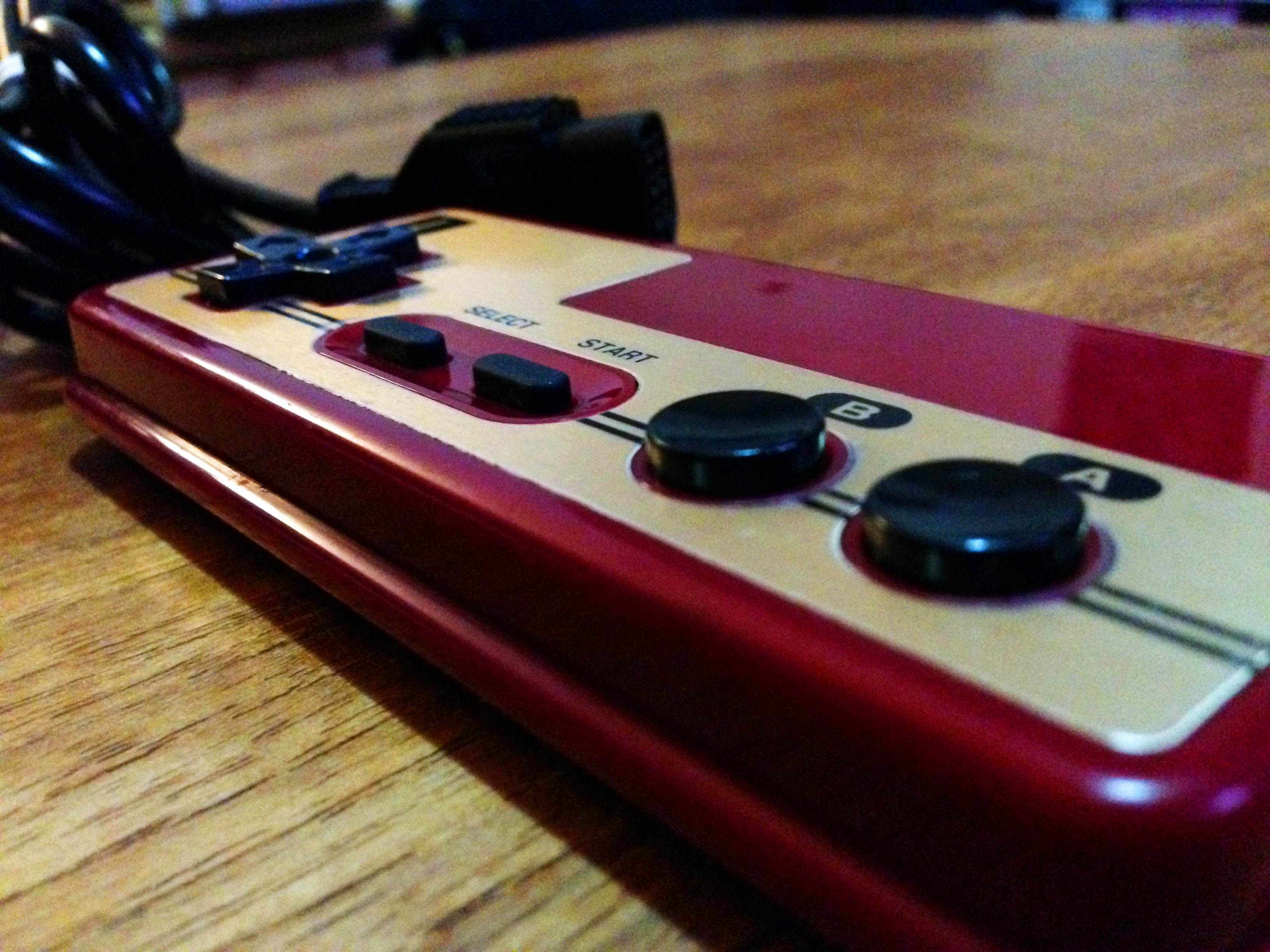
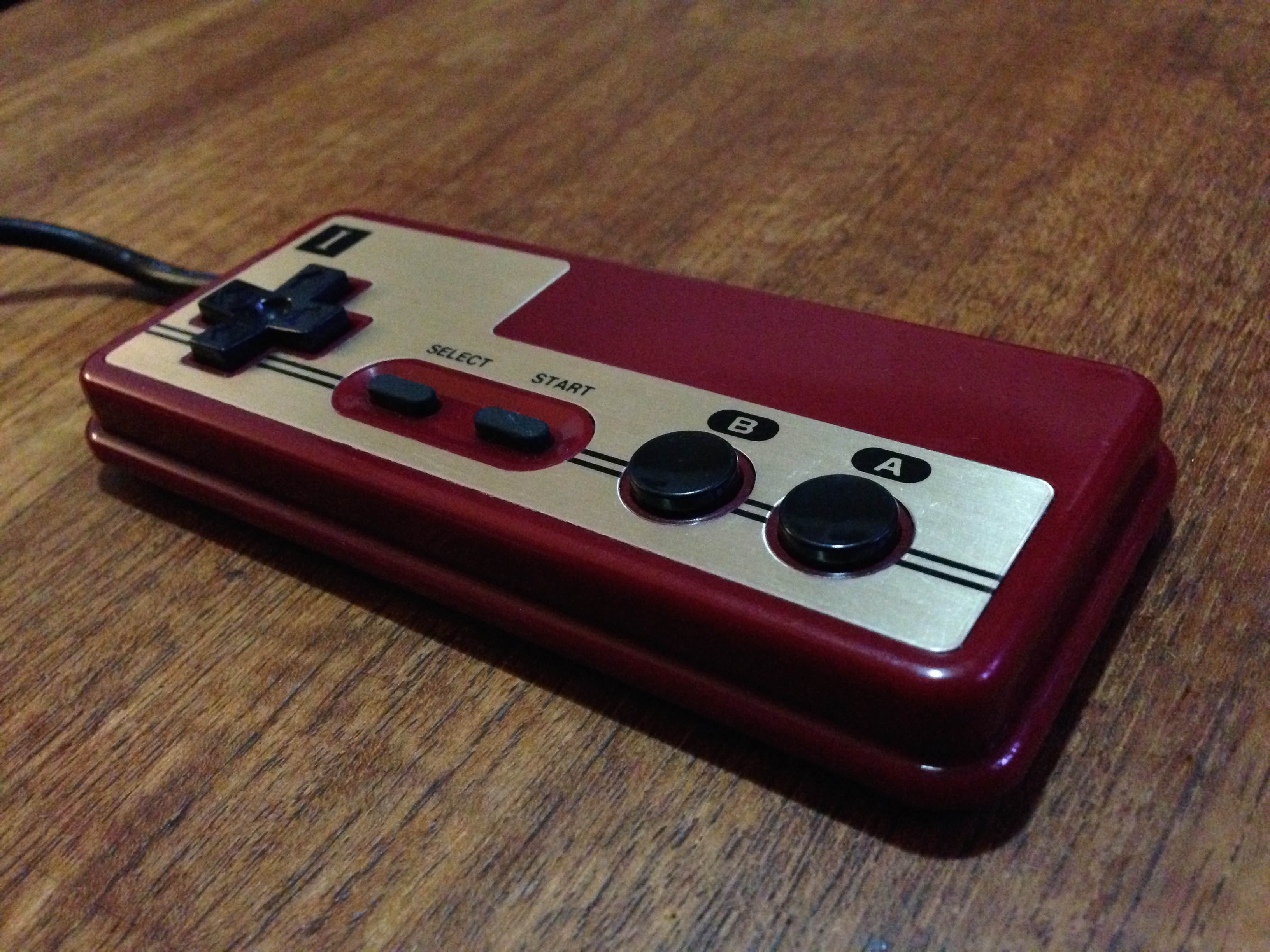
Want that classic Famicom feel without the hassle of having to sit two feet from the console?
Here’s the solution.
It’s an NES controller board and cord in an original Famicom pad shell.
Glorious gold faceplate on rich burgundy plastic. Rounded corners for that premium experience.
All the class, prestige and comfort of the original classic, without the hassle.
Perfect for the discerning Famicom enthusiast’s AV Fami needs.
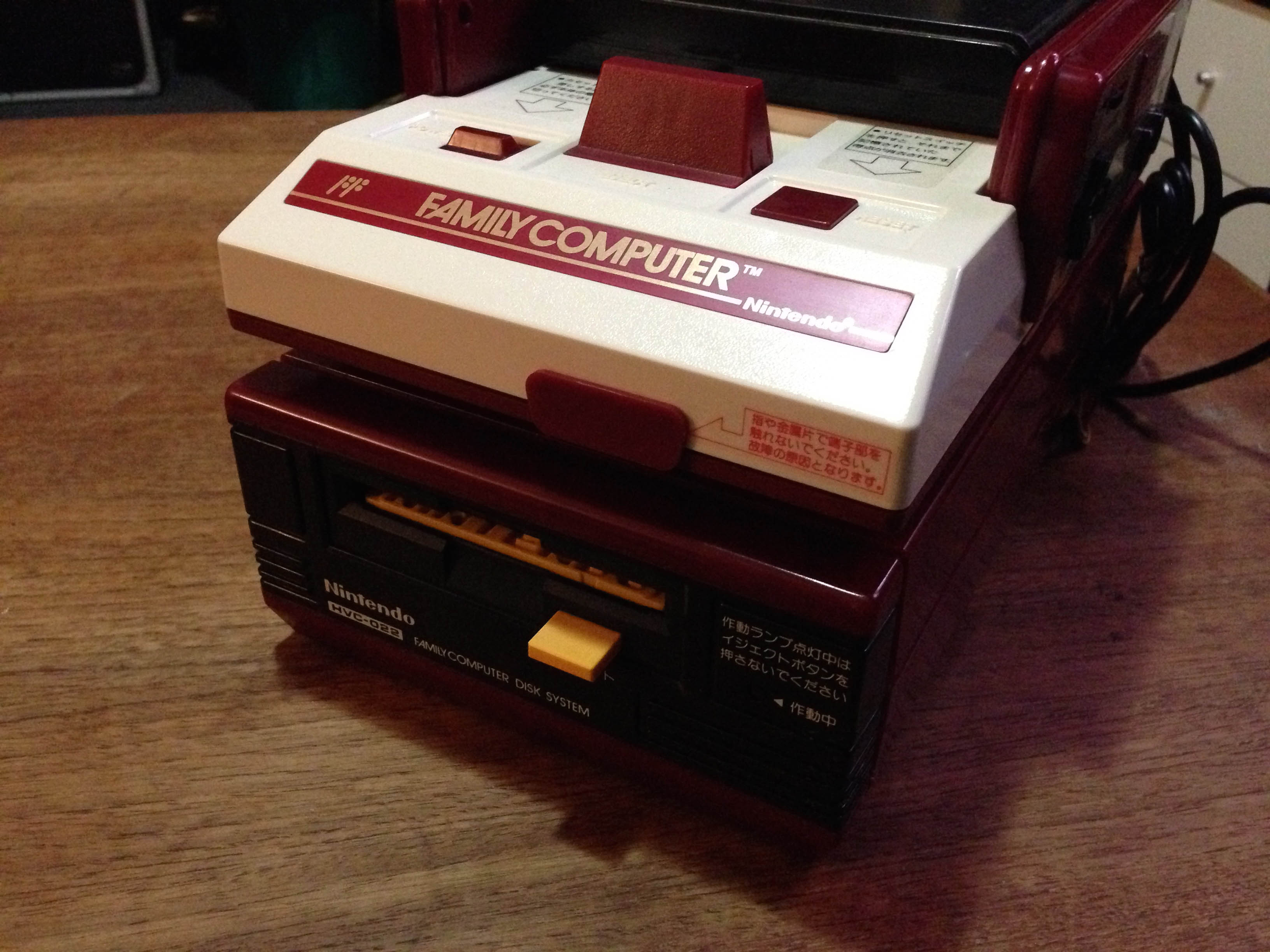
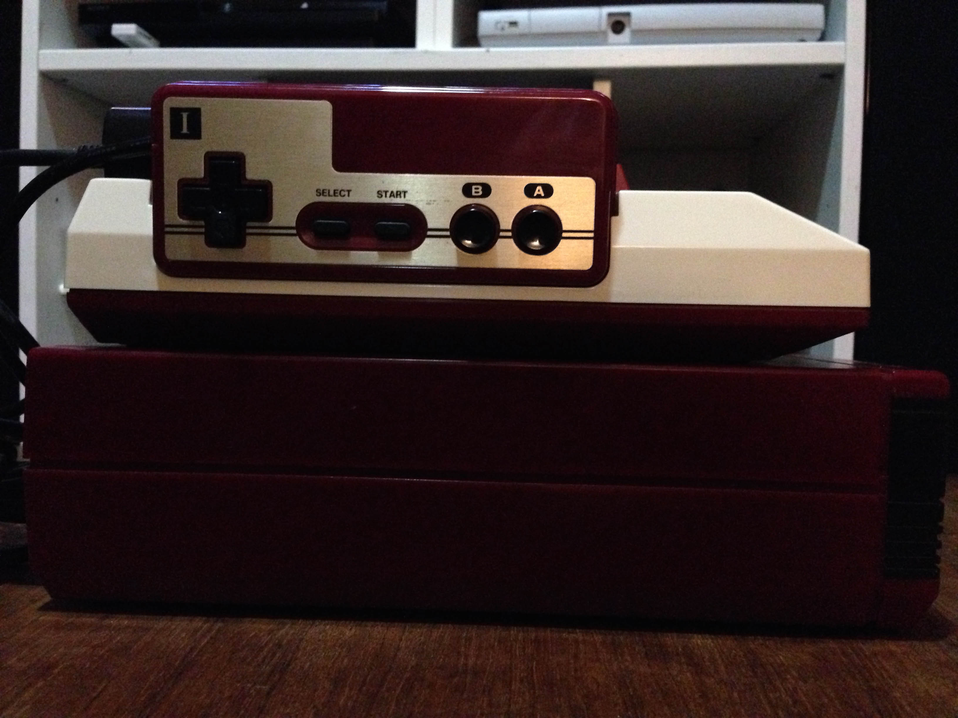
I do the same with The Super Fami. None of the SNES’ ugly lavender concave button nonsense, but with a much longer controller cord than the Super Fami pad.
Of course, Super Famicom Jr. controller cords are the full length already. But this sucker is staying mint in the box for now.
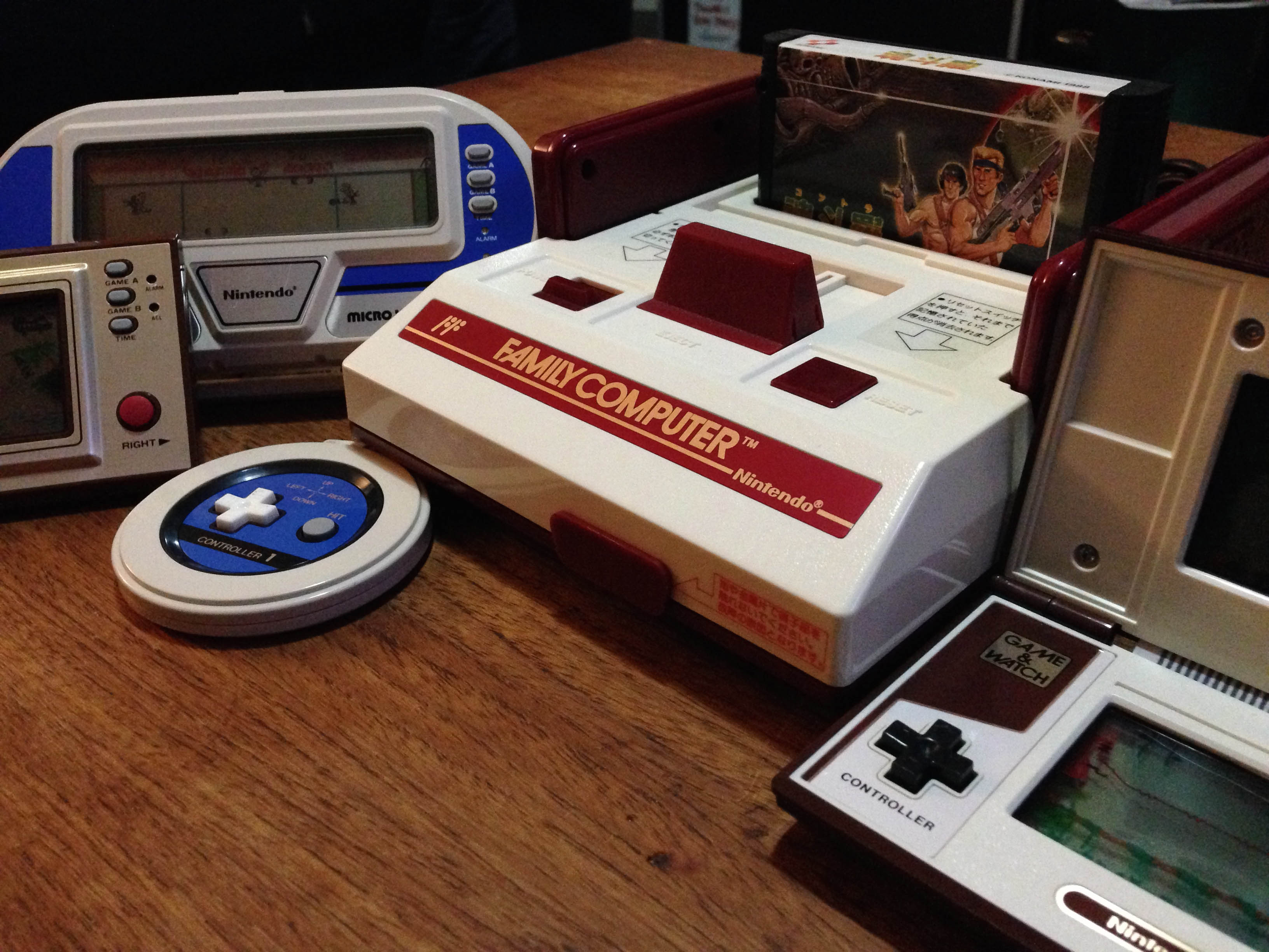
My ready-to-go Nintendo controller drawer. Sometimes you want Famicom, sometimes you want dogbone, and sometimes you want to rock out gajin style on the squared off NES pad.
Nintendo had such a classy ‘brushed metal on high quality coloured plastic’ aesthetic in the early 80s, carried over from their original ‘Color TV game’ console series, through the Game & Watch series, and on to the Famicom.
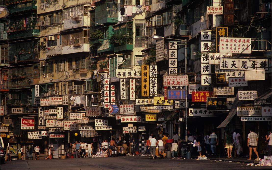
Kowloon Walled City was a lawless mini-city built just outside of Hong Kong.
Established on a legal ‘no-man’s land’ and unpoliced by either Britain or China, it thrived and became an amazing mass of humanity.
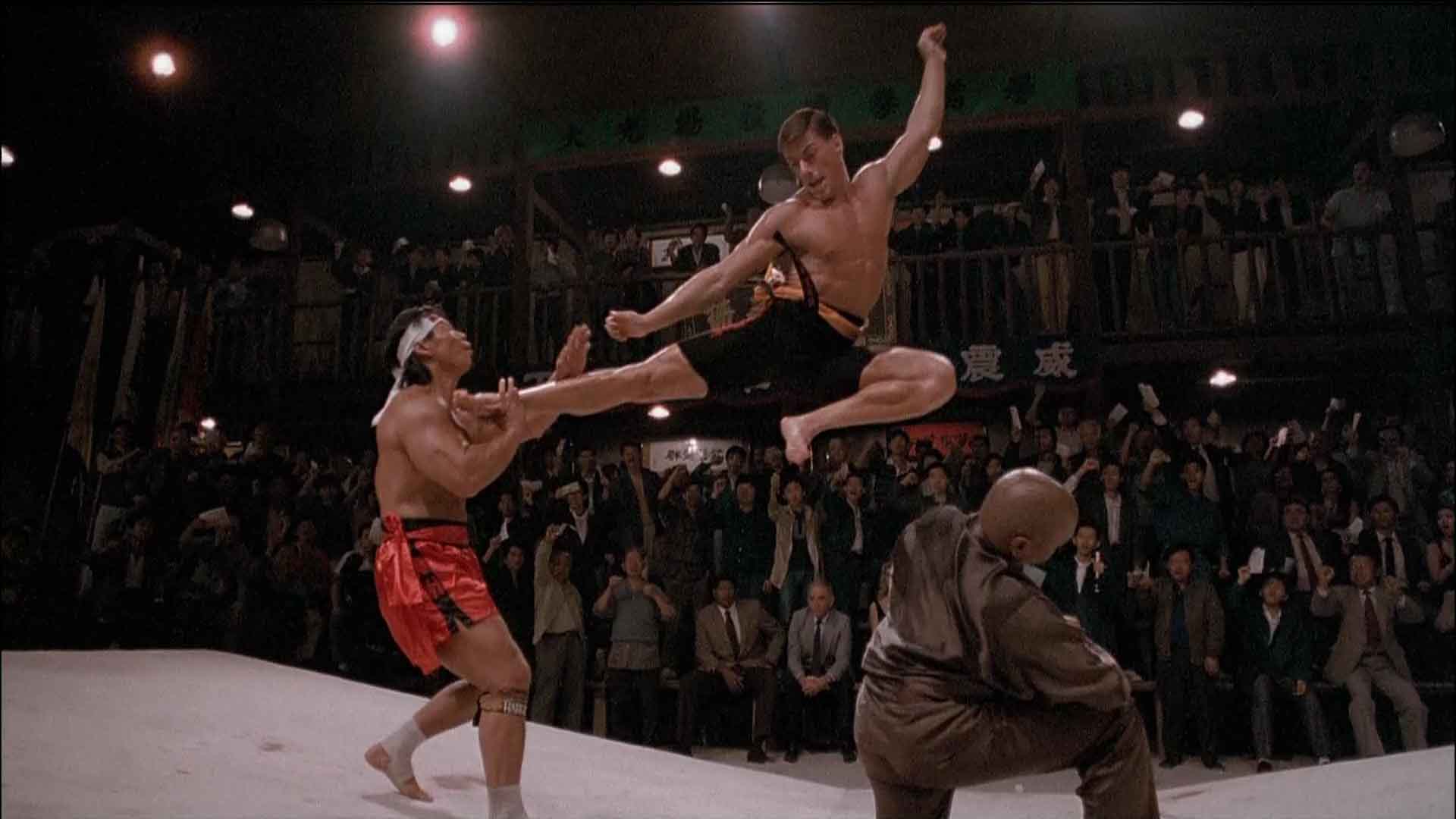
You might know it was the place the Kumite was held…
It was torn down in 1994, but I’ve always been fascinated by the place. I’ve been to where it once was, and all that is left is a boring park, with a few monuments like a piece of the original foundation, and a model of the old city.
What has this got to do with Japan?
It seems I wasn’t the only one who was fascinated by the walled city, as some of the interior has been re-created in Japan. It’s called the Kawasaki Warehouse, and it’s one of many amazing pet projects by Japanese designer Taishiro Hoshino.
So we got on the train out of Tokyo and headed for Kawasaki. It’s a bit of a walk, but easy to find once in the right area.
The entrance looks right out of Tim Burton’s 1989 Batman:
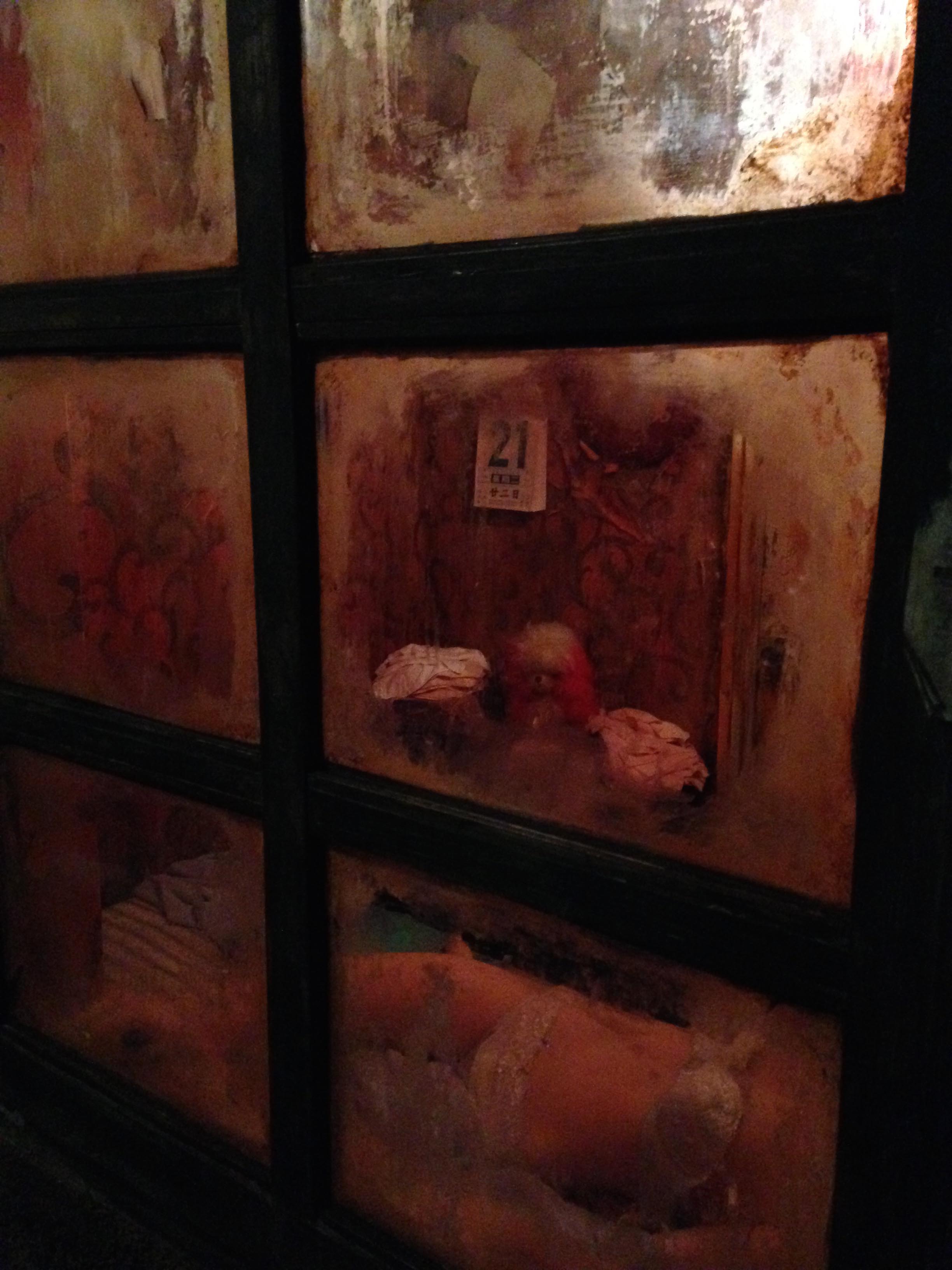
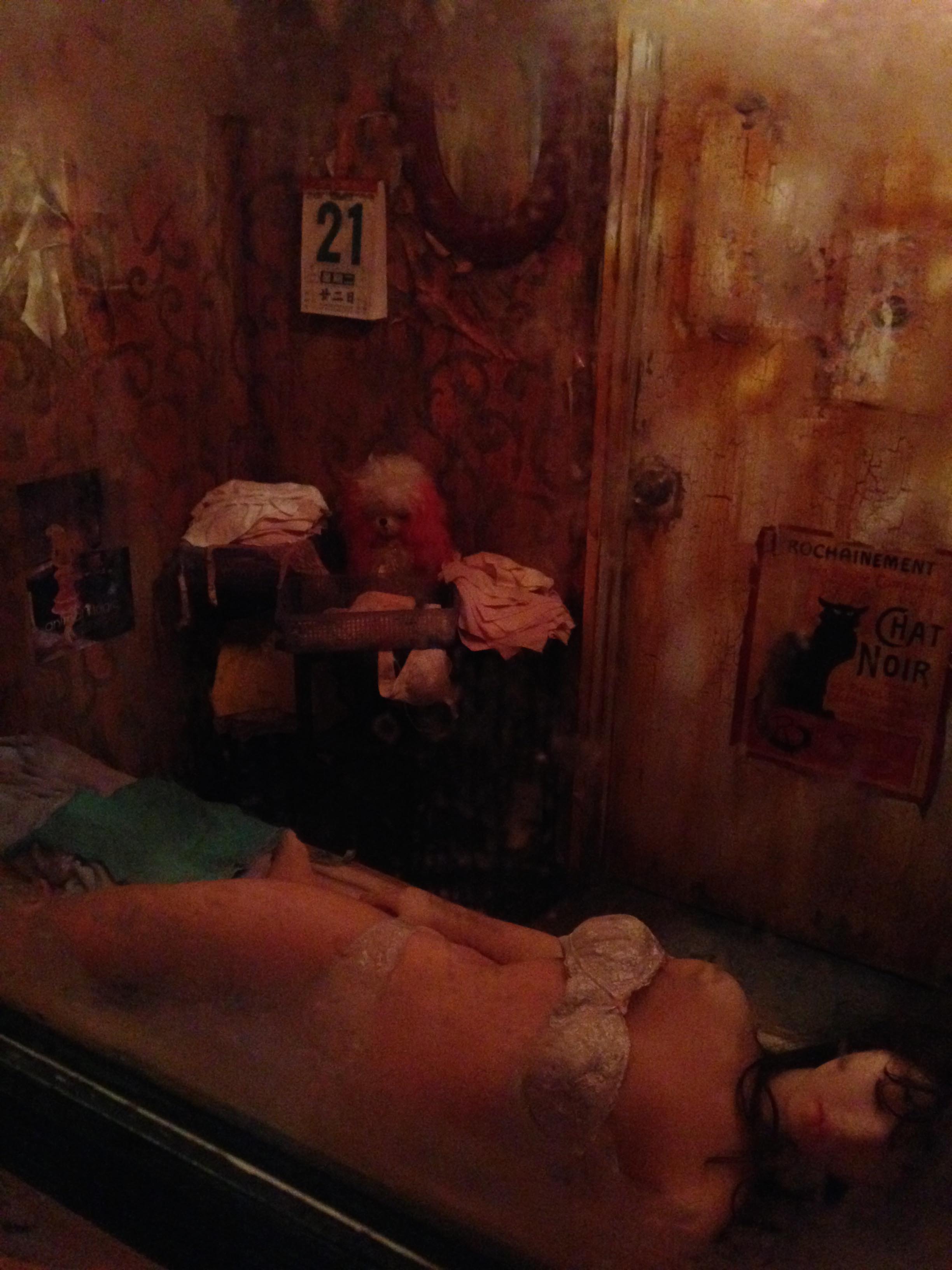
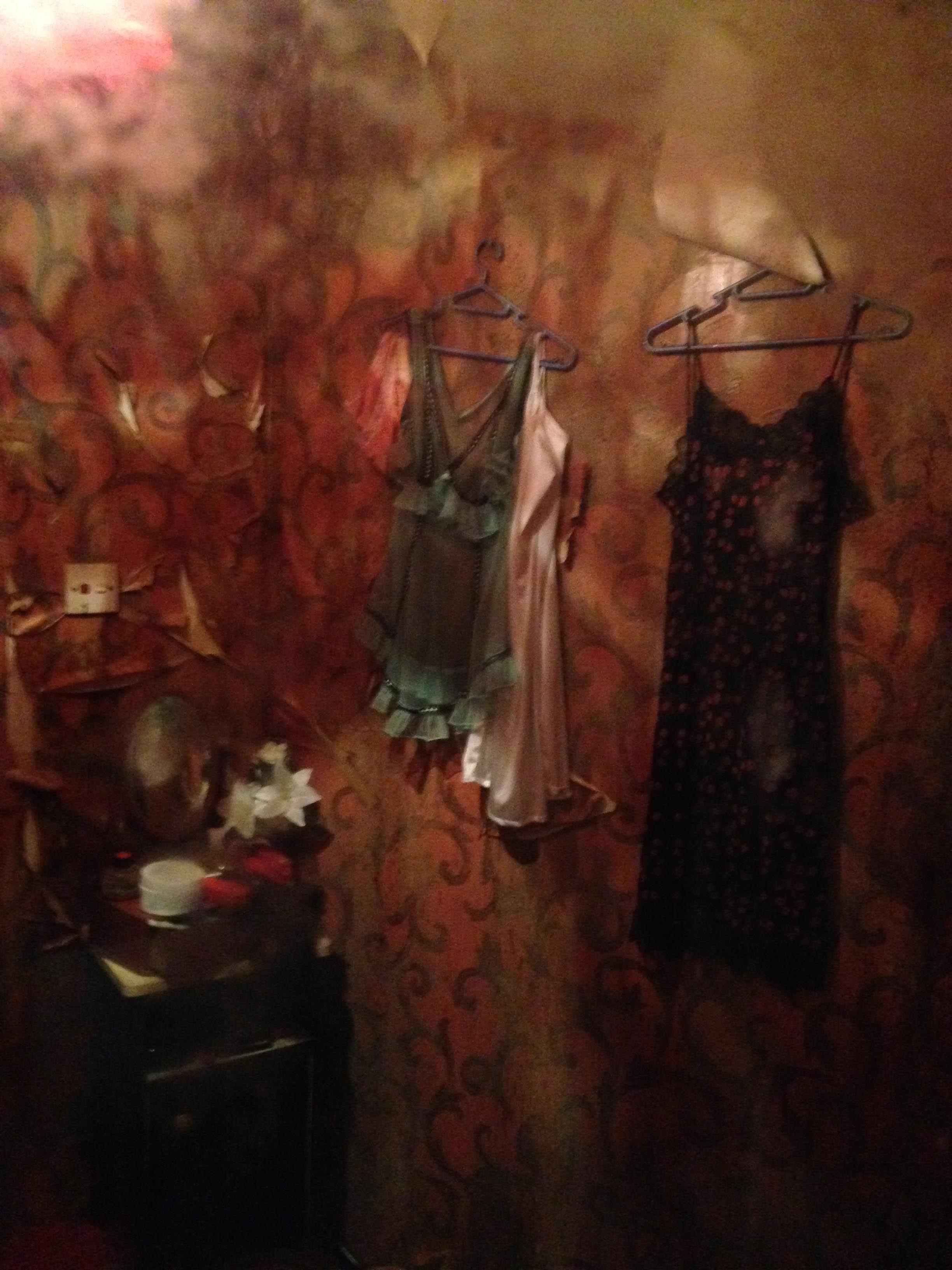
Inside you have to walk past pretend drug dens and prostitutes
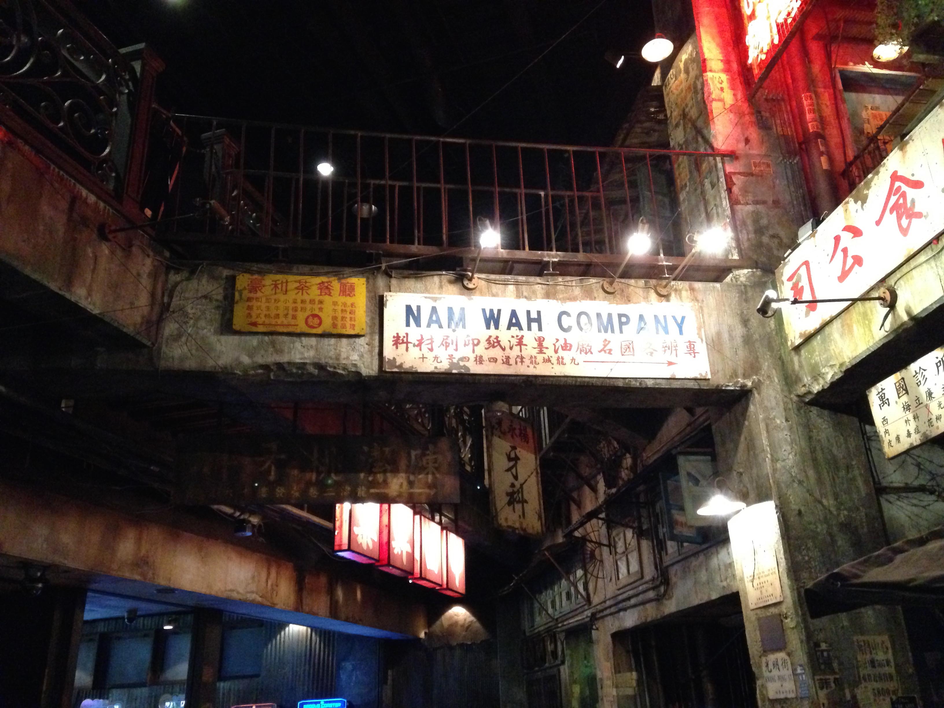
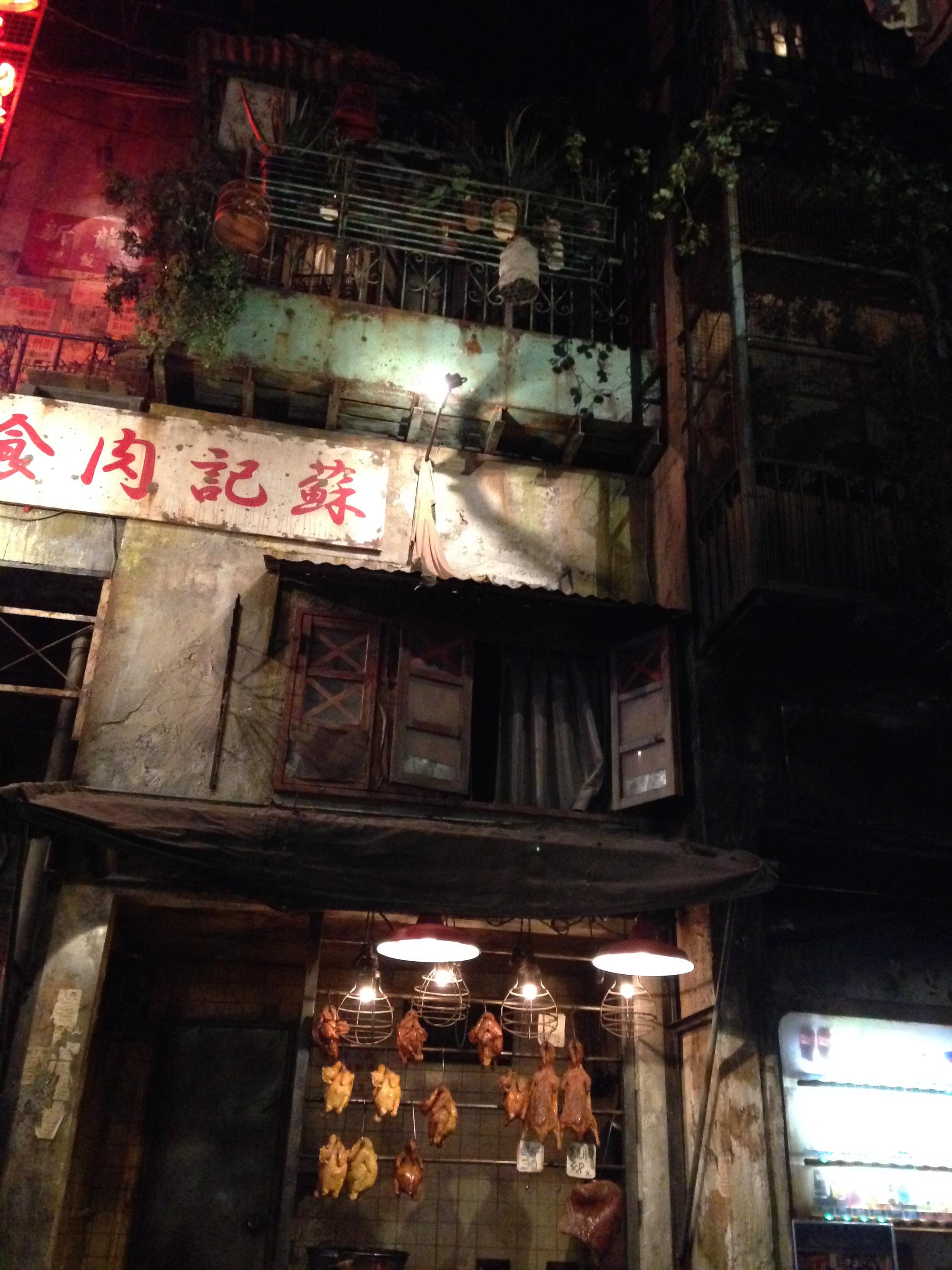
Until it opens up into a re-creation of the bustling city courtyards
That just happens to have an old-school video arcade inside!
Everything from Taito’s original three screen DariusTo a sit-down Outrun cabinetTo more recent offerings like Nintendo and Namco’s Mario Kart Arcade
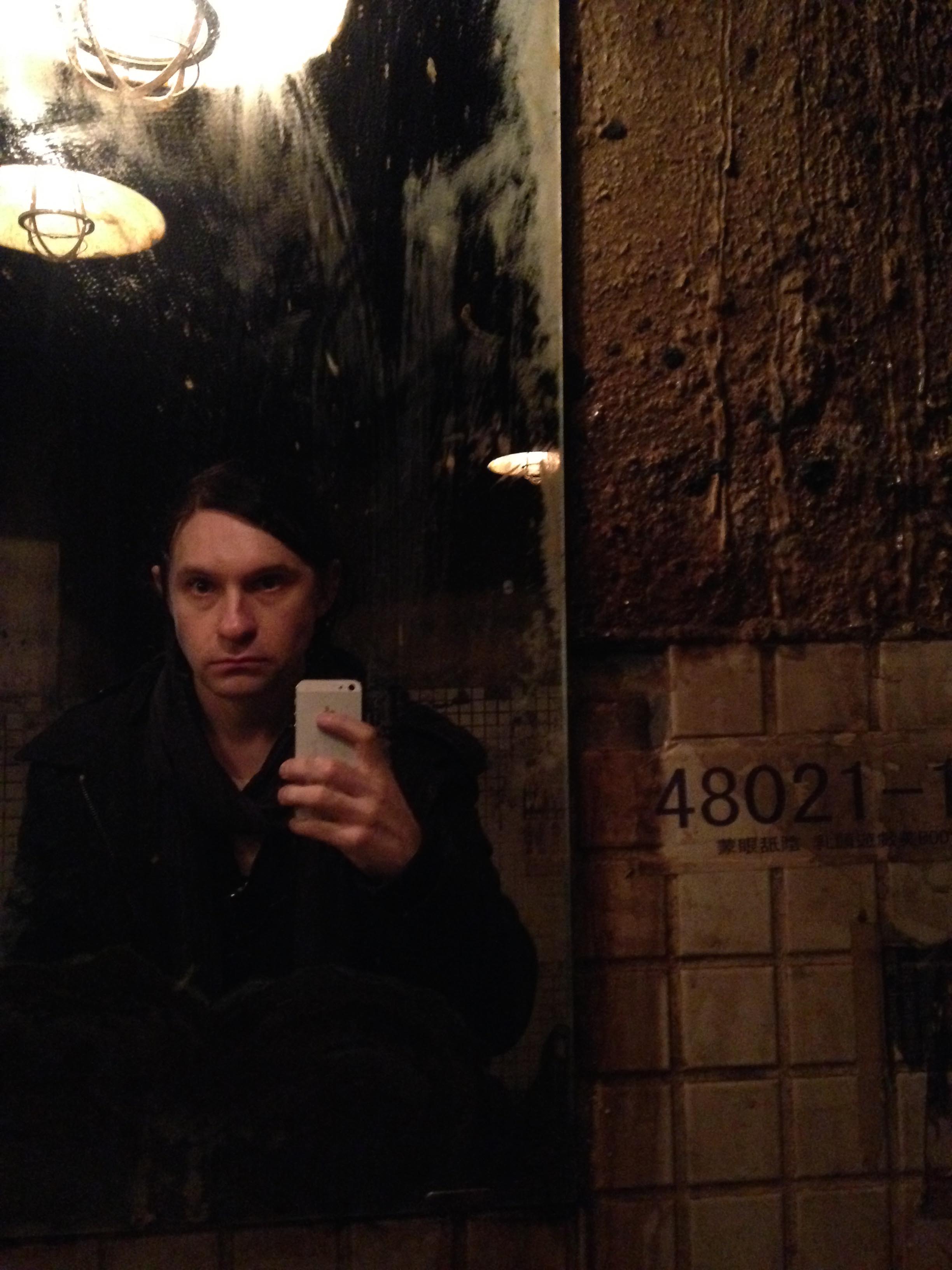
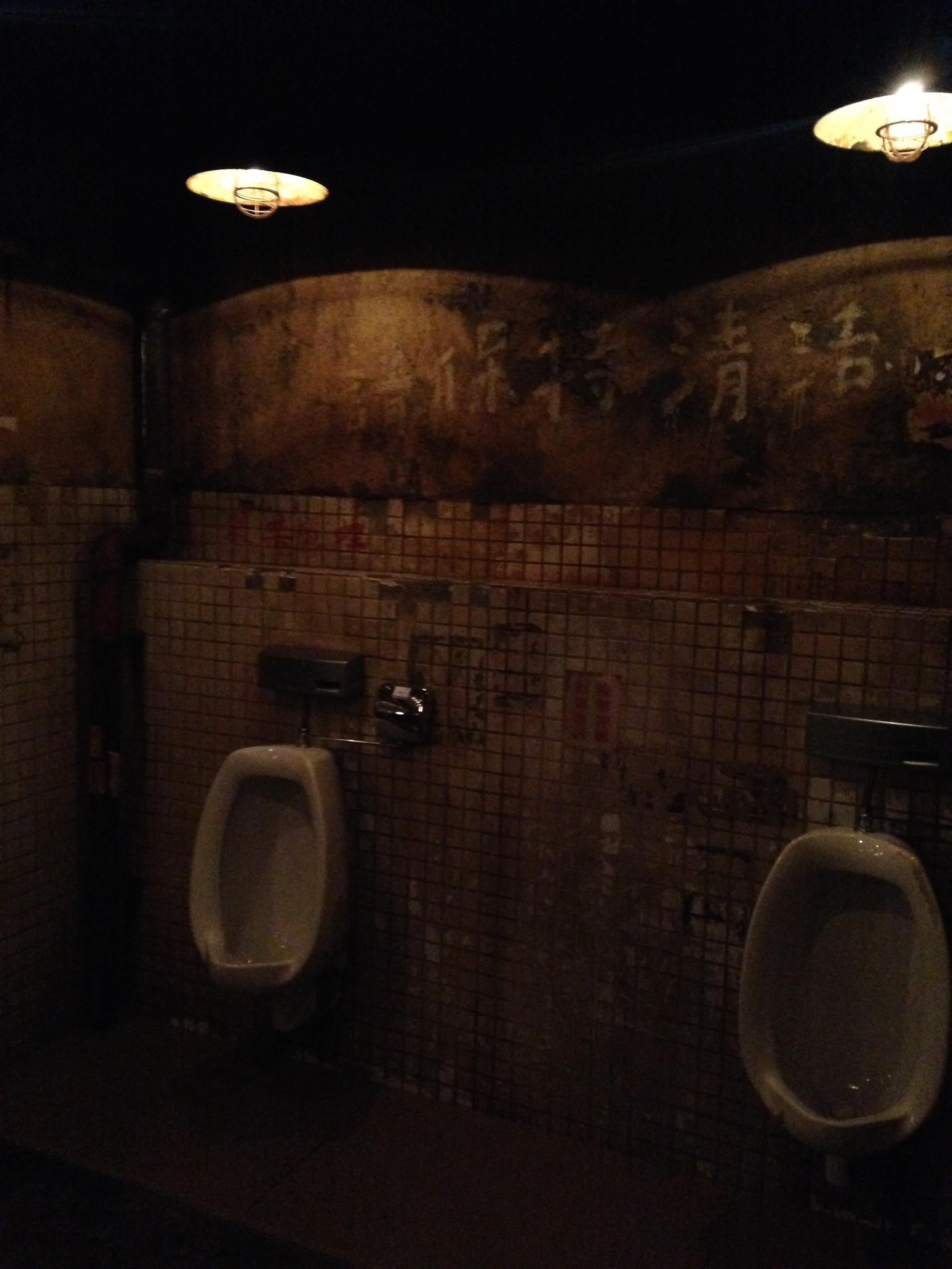
Even the bathrooms match the theme
I’m assured the ladies was much nicer!
Upstairs there’s a weird renaissance theme, and classy layout for various parlour games
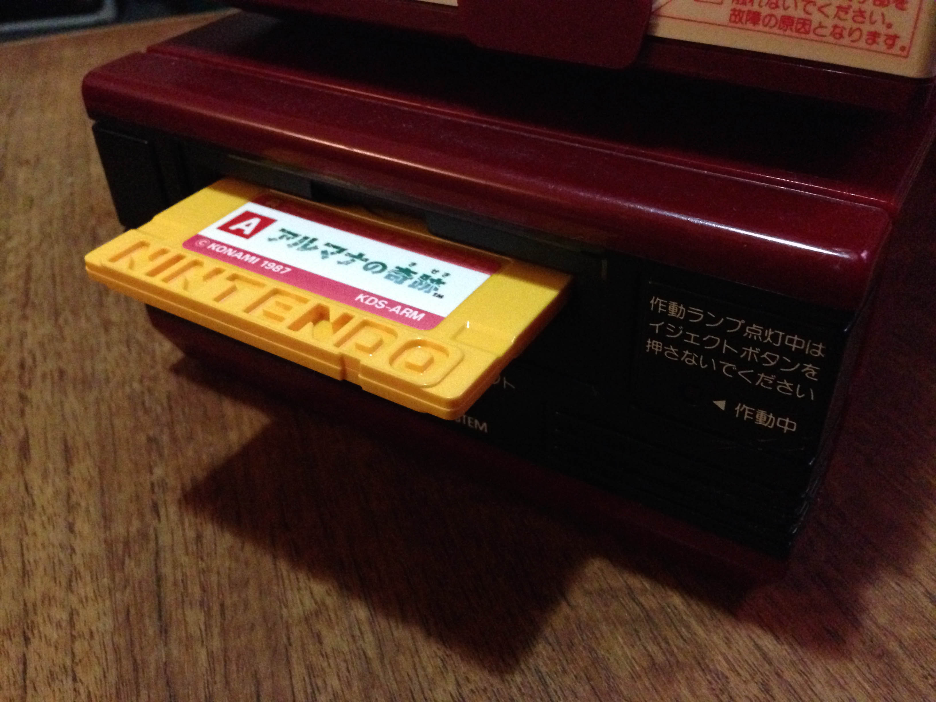
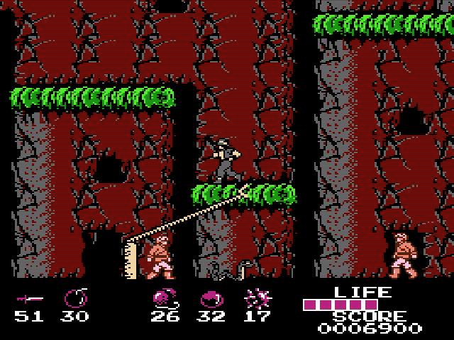
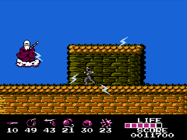
Of all the Konami Famicom/FDS games that didn’t leave Japan, this one is my favourite.
In the same way Castlevania was inspired by old monster movies and fantasy novels (including the Frazetta-esque art), and Contra was inspired by Aliens and Rambo, Miracle of Arumana is pretty much Indiana Jones. It’s so close in fact it even seems possible development began on the basis of gaining the licence at some point. I mean, look at these screenshots:
There’s even a mine cart level
The plot is a slightly more cartoony version of Temple of Doom – the miraculous Arumana stone has been stolen from a remote (presumably Indian) village by some powerful supernatural force, and without its power the people are helpless against the evil. The land is ruined and the peaceful locals have been turned to stone.
You play as a younger, more Japanese looking Indy, who has come across this injustice during his adventures and sets out on a quest to defeat the evil force and restore the Armana stone to its rightful place.
It’s a jolly little platfomer with a fun (if not particularly accurate to the laws of physics) grappling hook mechanic. The hook feature is nowhere near as involved as the one in Bionic Commando, but definitely adds to the experience, allowing interesting navigation possibilities around the levels.
What sets it apart are the graphics and music. It’s in the top tier of that era’s Famicom games graphically, with that fantastic slightly gritty Konami look (including the trademark ‘faceless’ characters). The music is in my opinion literally the best use of the Disk System’s extra sound channels. This is almost Akumajou Densetsu (Castlevania 3) level here, among the absolute best on the Famicom. It uses the louder extra wave channel for a ‘horn’ type sound, for an 8-bit version of a classic adventure movie score.
Promotional flyer
It’s also a vastly superior Indiana Jones game to any of the official 8-bit Indy games. In fact it’s the best Indy game on any consoles at all until the excellent Nintendo 64 version of Indiana Jones and the Infernal Machine.
An English translated version is out there with the title ‘Miracle of Almana’. While that is legitimate translation of アルマナの奇跡 without context, it’s clearly incorrect. The product code of the game is ‘ARM’ – including the R means it was meant to be translated ‘Arumana’ or simply ‘Armana’.
This is my sealed copy.
This is an amazing game. If this had made it to the west, I’m sure it could have been a long running series, just like Castlevania and Metal Gear. But perhaps Konami were afraid of Lucasfilm’s lawyers.
Full colour manual with that classic Konami manual art.
More screens:
I first leaned about this game about 15 years ago on Tsr’s NES archive. The piece is still alive today, check it out!
There was a point in time where Konami were the world’s best developer of video game software.
They also had the best box art and the best presentation. Today, I’ll focus on one element of this – the back of Konami’s Famicom/FDS manuals.
While their box art was the best in the business (I’ll save that for another day) an awesome little detail they started right off the bat on the Famicom was unified presentation. Their first gen of games came in Orange boxes, and had a unified design that mimicked Nintendo’s ‘pulse line of games.
The manuals similarly were uniform, with a plain (old) Konami logo on the back.
Upon rebranding the company with their awesome ‘two ribbons’ logo, a new motif began, and was maintained for the rest of their Famicom/FDS run. All boxes (or manual covers which doubled as box art in FDS games) would have the Konami logo top left, and the back cover would feature a single small image representative of the game.
Pennant Chase Baseball back cover
It’s most prominent on the Famicom Disk games, as they had full colour manuals.
While Konami had similar branding discipline for at least a few years in the US with their awesome silver box line, their NES manuals simply had the game logo on the back. But interestingly, their silver box Game Boy games continued the trend.
I use the Everdrive N8 for most of my game playing. While I love collecting physical games in boxes, I largely keep them in the box and use the Everdrive to play the games I own.
I bought it a couple of years ago with a shell. It’s a classy transparent plastic, but it always annoyed me how the shell was taller than a standard Fami cart. It seems these are still the shells being sold with the carts even today too.
However, I found a seller on Alibaba who sells knockoff Everdrives (Pirated piracy carts…), and he sells a shell separately as well. And it looked pretty good so I grabbed one.
It’s every bit as high quality as the real one, and even comes with an equally professionally printed label. But is the right height! So much better.
I got blue this time, because the red didn’t go well with the OG Fami. Blue looks amazing.
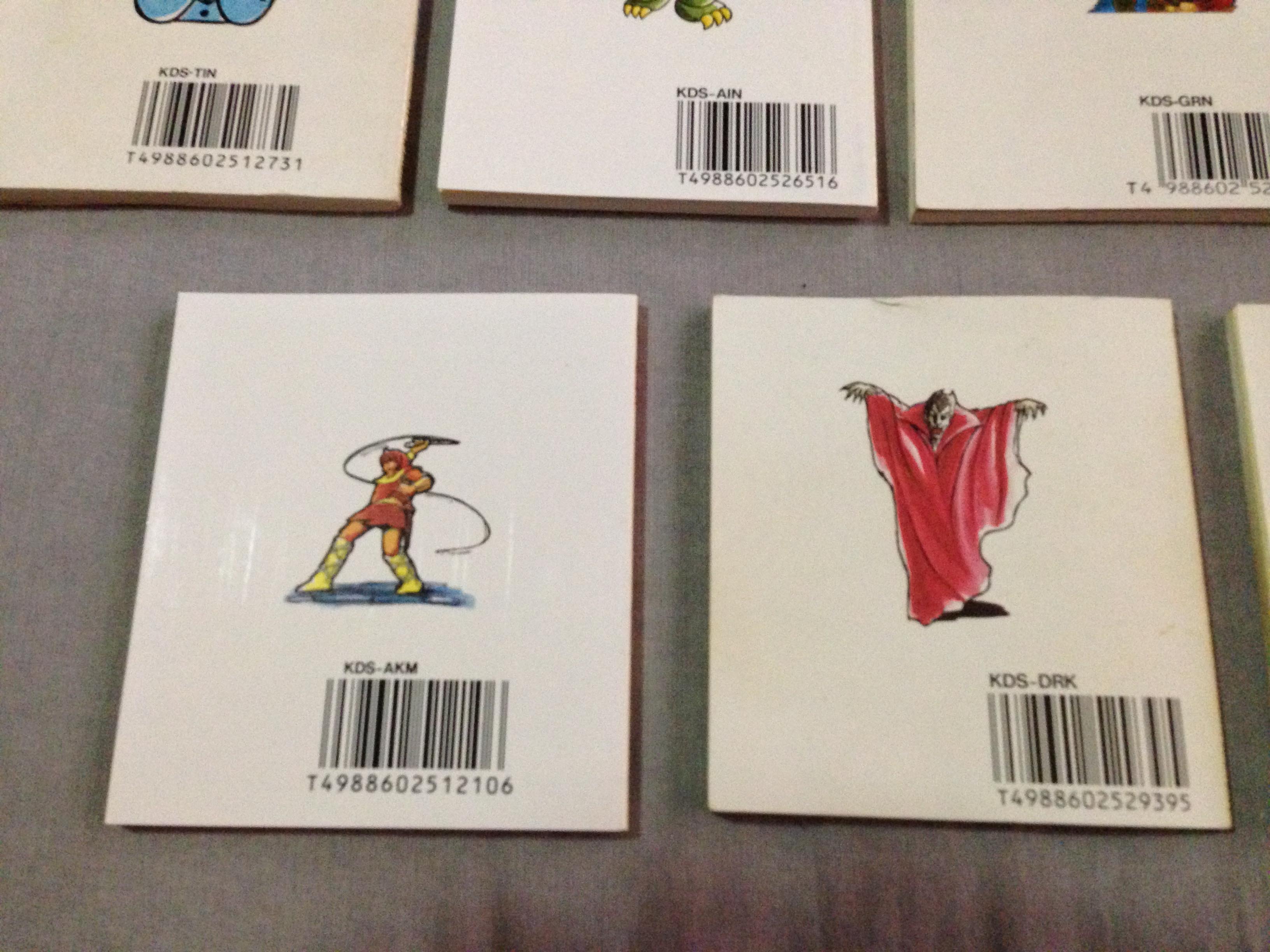
At some point starting in 1987, Konami decided to include a collector card with all their titles. Each card had an illustration related to the game. Some cards had screenshots or pieces of screenshots, others had artwork of scenes in the game.
There were multiple cards for each game, so perhaps Konami thought kids would be encouraged to get the same games their friends had to trade cards? Apparently it didn’t work, so they stopped including cards a couple of years later, and only the following 20 titles ended up with the cards:
I have the bolded ones already, and I always like the idea of complete sets of something (when the goal is achievable) so I’m on a mini-collection quest to get one card of each game that had one.
Of the ones I have, I like Arumana no Kiseki and Astro Boy best.
So now I have 12 to go. Some will be easy to get (there are plenty of cheap copies of Konami Baseball and Basketball), some will be harder (popular titles like Salamander and Metal Gear). Do Re Mikka will likely be hardest, it’s a very expensive music game that came with a piano keyboard controller.
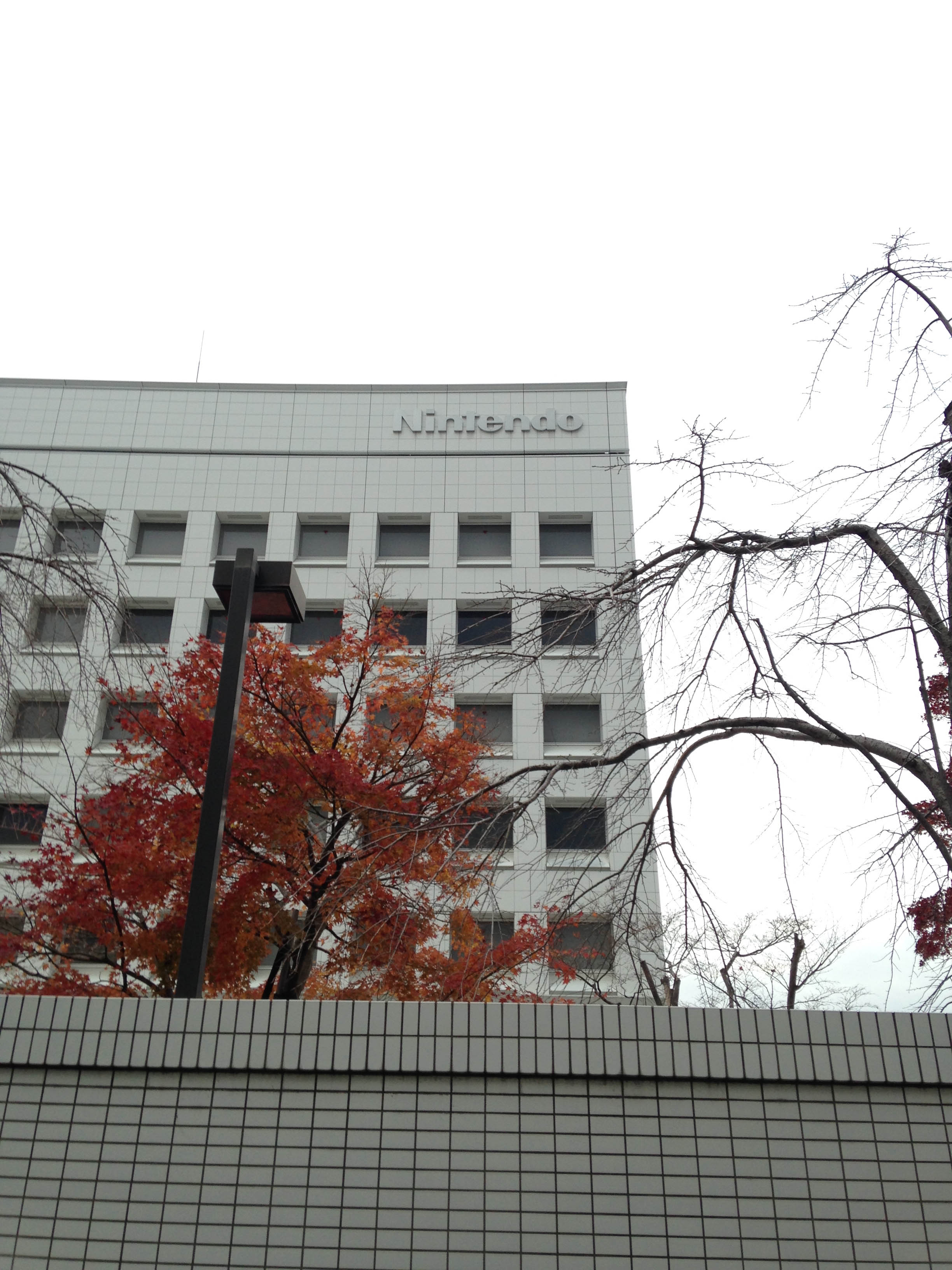
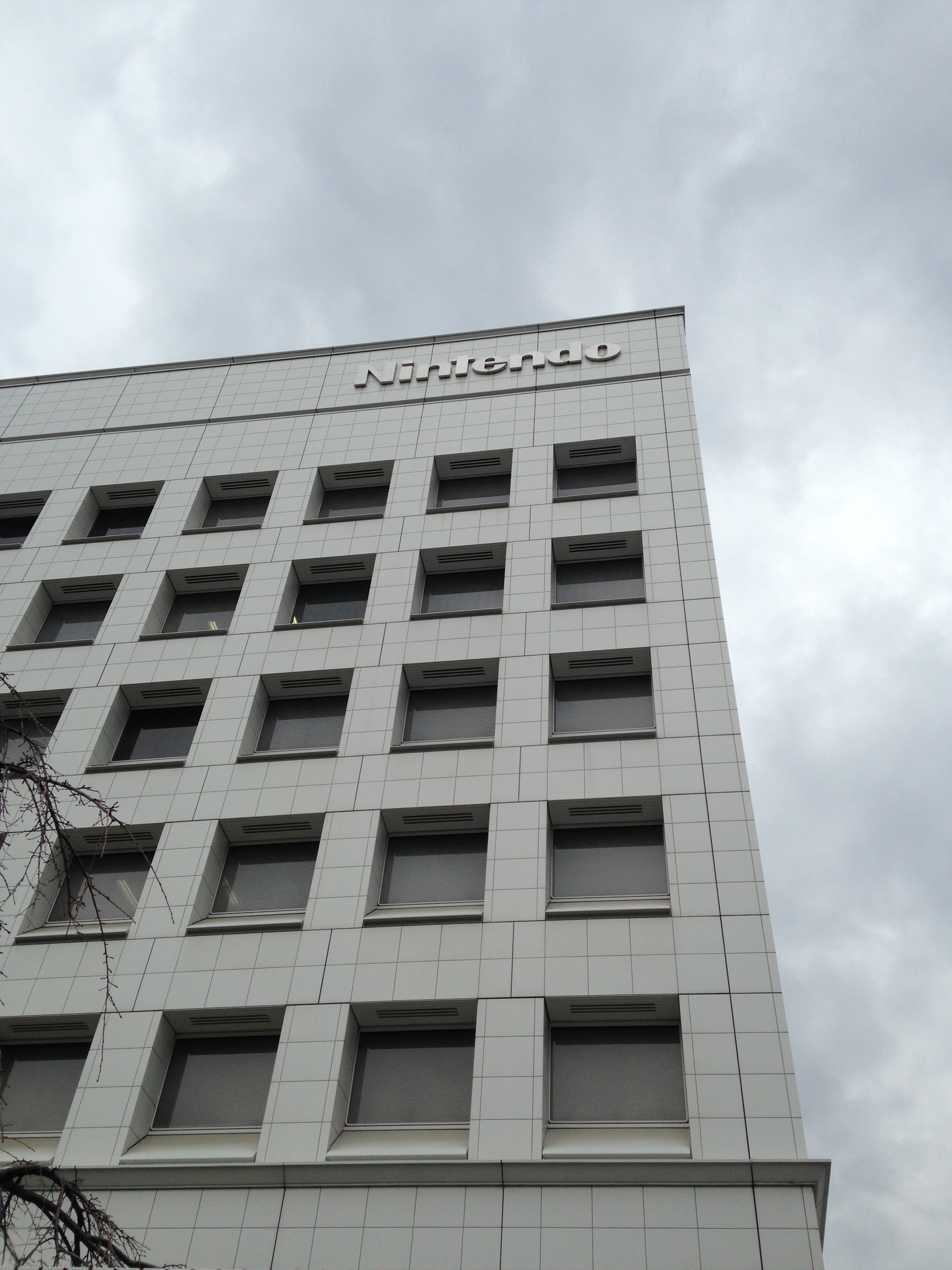
I’ve been a Nintendo fan for 30 years, and I was in Kyoto for the first time. Well I had to go to Nintendo, didn’t I?
First stop was very hard to find, and Google (at least in English) was very little help. I wanted to see the oldest surviving Nintendo building, buried in the backstreets of a now largely residential area of Kyoto.
After some research (largely machine translating Japanese walking tour maps), I worked out it was somewhere near here, which was around 15 minutes walk from the apartment we were staying in.
So we set off the next morning. After a lot of wandering in the freezing cold winter air, we found it!
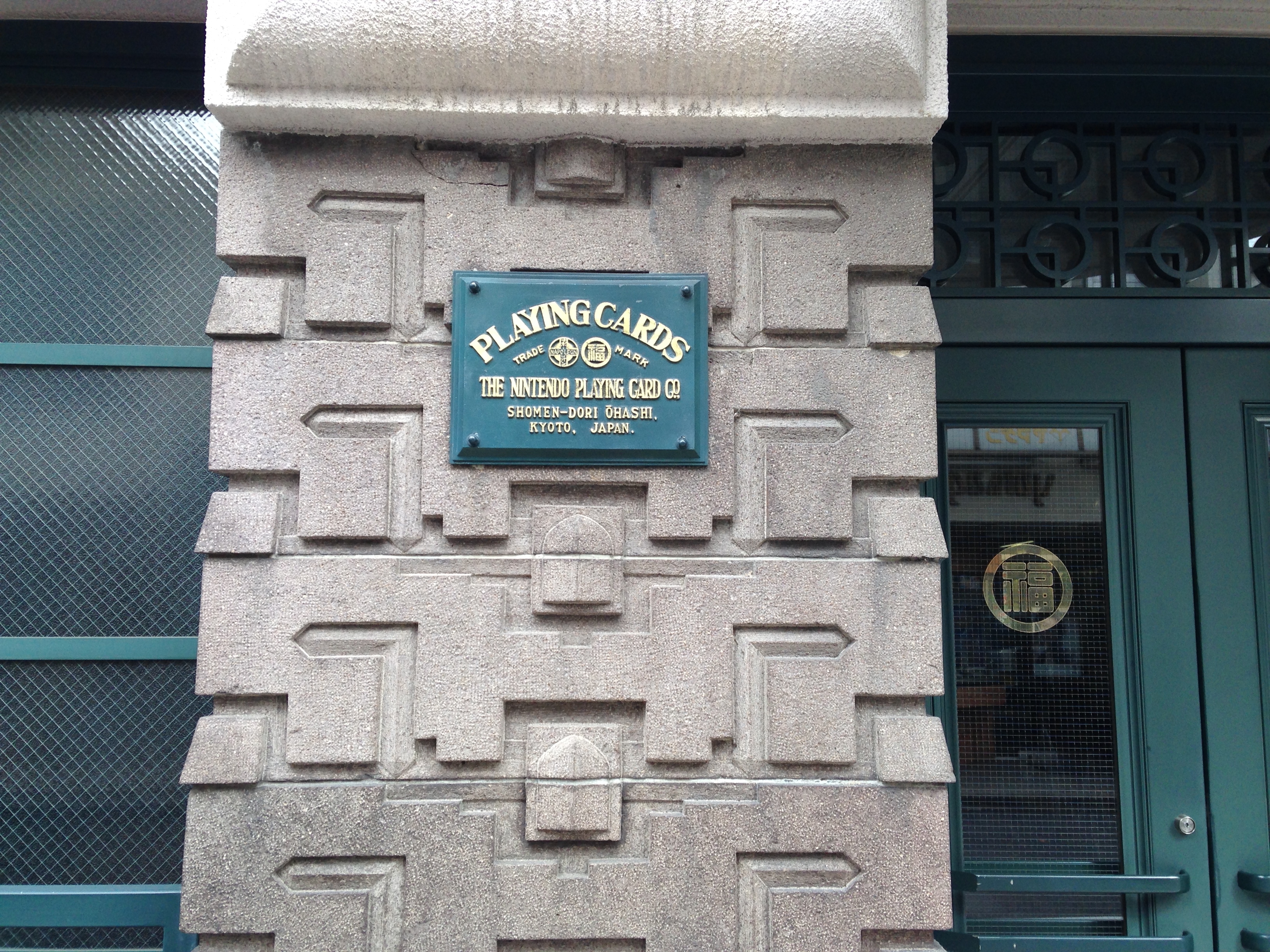
Built in 1933, it sits on the same land as the original headquarters from 1889. While nicely designed with lots of detailed flourishes, it’s an otherwise relatively nondescript building. Except for two plaques:
The sign references Japanese playing cards ‘Karuta’ (かるた) and western playing cards ‘Trump’ (トランプ – Toranpu)
This was their playing card factory and distribution centre before they became a larger toy company, and it has stayed in company hands.
I took a peek inside as well, it is clearly well maintained and clean, and in some form of use.
It appears to have been maintained perfectly from the 1933 until today.
The next stop would be much easier to find. It was about 40 minutes walk away through residential and industrial areas, though we stopped in at a couple of Kyoto’s famous temples along the way.
Until it appeared…
Mecca.
Two blocks away there is the other monolith, the new development building.
Not too much to see, you’re not allowed in either building. But they do have a nice big sign at the development centre.
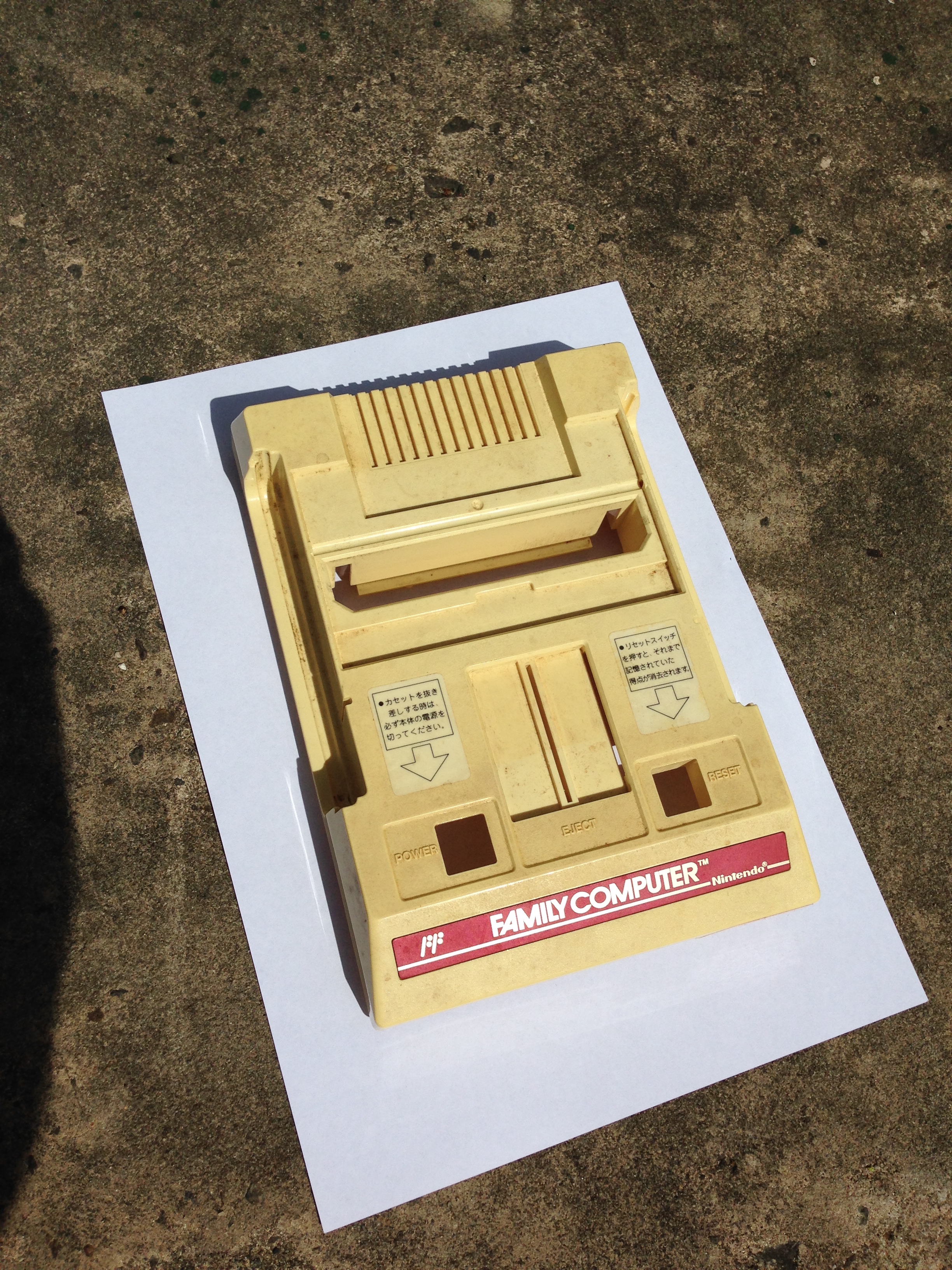
I bought another Famicom for super cheap on eBay. But it’s pretty grimy and yellowed, like most original Fami consoles.
Also quite filthy.
Here it is compared to my main original Famicom.
Comparing both to the picture on the box, my good Fami seems even whiter than expected!
Time for another hydrogen peroxide session.
When de-yellowing a Famicom, there’s a difficult choice to make because of the stickers on the top. While the console is usually not as yellowed under the stickers, when processing, the area under the stickers won’t be affected, as it’s protected from the peroxide, and the whole unit won’t lighten evenly. So you have three choices:
Leave the stickers and end up with a console with yellow spots under them
Remove the stickers and have it lighten evenly (they can be replaced, but replacements are relatively expensive)
Leave the stickers and carefully lighten it just enough to match the yellowness under them.
I’m choosing option 3 today. All stripped and ready to treat.
On goes the peroxide, with cling wrap to help it not dry out, as drying can cause scarring on the plastic. The Australian sun can be ruthless.
Just 20 minutes later and almost done. Just trying to match the under-sticker colour.
Done, washed and dried. I could have gone whiter, but it’s now a pretty damn good match for the under-sticker colour, for a nice consistent tone.
A bonus is that the peroxide also lifts the ingrained grime of filthy consoles like this one was!
Reassembled next to my main Fami. Just slightly yellower now.